This quick tutorial will show you the very basics of using Shapefiles in R to generate maps with ggplot2 and rgdal.
Along the way, we will create a Hospital Density Map for Scotland as the one below:

Before We Start
Geospatial data files aren’t necessarily free, in fact, a lot of service providers charge a handsome amount of money for them (after all, the generation of these files takes time, effort and money). So before we start creating maps with R we have to address one other question first: Where can we get Shapefiles for free?
It probably depends on where you live but in many countries the respective governments provide free Shapefiles. As per usual in this day and age, Google is your friend. Nonetheless, here is a list of websites that I find to be useful sources for Shapefiles:
Once you have found and downloaded the Shapefiles you are interested in, they typically come as a zip file, we can get going. As the very existence of the zip file possibly alludes to, a “Shapefile” isn’t actually a single file but a collection of files. There are 3 mandatory files, namely:
.shp— shape format; the feature geometry itself1.shx— shape index format; a positional index of the feature geometry to allow seeking forwards and backwards quickly1.dbf— attribute format; columnar attributes for each shape, in dBase IV format1
Chances are that the zip folder you downloaded will contain other supporting files such as .prj or .sbn. For more info on these, head over to Wikipedia.
If you haven’t done so already, unzip the Shapefiles and add them to your R project directory in an appropriately named folder. For me this would be ~\Projects\Shapefiles-in-R\data. In the end your project directory might look something like this:
Projects
+--Shapefiles-in-R
|  +--.Rhistory
|  +--Shapefiles-in-R.Rproj
|  +--data #Shapefiles are here, see below:
|     +--SG_NHS_HealthBoards_2018.cpg
|     +--SG_NHS_HealthBoards_2018.dbf
|     +--SG_NHS_HealthBoards_2018.prj
|     +--SG_NHS_HealthBoards_2018.shp
|     +--SG_NHS_HealthBoards_2018.shp.xml
|     +--SG_NHS_HealthBoards_2018.shx
|  +--mappymaps.R
In this tutorial I am using the NHS Scotland Health Board Shapefiles distributed under Open Government Licence.
Copyright Scottish Government, contains Ordnance Survey data © Crown copyright and database right (insert year); The dataset covers all of Scotland, and is coterminous with Local Authorities (OS BoundaryLine, October 2017 with amendments at Keltybridge and Westfield); Open Government Licence (http://www.nationalarchives.gov.uk/doc/open-government-licence/)
Get the files here by clicking on: Download Shapefiles
Reading Shapefiles into R
In R Studio, open a new R Script and add the following:
library(tidyverse)
library(rgdal)
NHSBoards <- readOGR(dsn = "filepath/data",
                     layer = "SG_NHS_HealthBoards_2018")
The readOGR function from the rgdal package takes two arguments, dsn= (data source name) which is the folder/directory where the Shapefiles are located, e.g. ~\Projects\Shapefiles-in-R\data, and layer which is the name of the shapefile without the .shp extension, so in our case SG_NHS_HealthBoards_2018.
At this stage it’s probably not a bad idea to have a quick look at the general structure of your Shapefile, which should look like this:
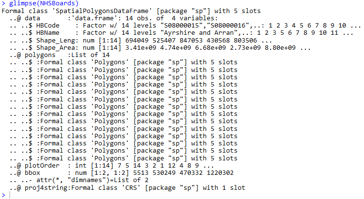
Notice that we have 5 “slots” stored in NHSBoards object, namely @data, @polygons, @plotOrder, @bbox and proj4string. These slots can be accessed using @ and the first two are the main interest here. You can think of the @data slot as a table that stores attribute data pertaining to the geographic area of interest. As the name suggests, the @polygons slot contains the actual polygons (or lines in some instances - @lines) that are used by R to draw the map.
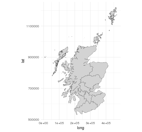
A First Simple Map
In order to get the most out of ggplot’s map drawing capabilities it is best to get NHSBoards into tidy format using the tidy() function of the broom package.
library(broom)
NHSBoards_tidy <- tidy(NHSBoards)

ggplot(NHSBoards_tidy, aes(x = long, y = lat, group = group)) +
  geom_polygon(color = "black", size = 0.1, fill = "lightgrey") +
  coord_equal() +
  theme_minimal()
Please note: Calling tidy() on NHSBoards will remove the @data attributes. Luckily, we can add @data again with a simple left_join as shown later.
Resulting map:
Adding Data Attributes
Although our map looks very neat, there isn’t an awful lot of information to take from it. Let’s change this by adding @data back to our NHSBoards_tidy object.
NHSBoards$id <- row.names(NHSBoards)
NHSBoards_tidy <- left_join(NHSBoards_tidy, NHSBoards@data)
Let’s also add an additional bit of information, i.e. the number of NHS hospitals within each Health Board according to this ISD Scotland source.
hospitalsSco <- data.frame(HBName = sort(NHSBoards@data$HBName),
                           Hospitals = c(16,15,23,12,8,34,45,28,20,34,1,1,32,3))
NHSBoards_tidy <- left_join(NHSBoards_tidy, hospitalsSco)
Now let’s produce a map that colours each individual Health Board based on the number of hospitals within it:
ggplot(NHSBoards_tidy, aes(x = long, y = lat, group = group, fill = Hospitals)) +
  geom_polygon(color = "black", size = 0.1) +
  coord_equal() +
  theme_void() +
  labs(title = "Hospital Density in Scotland (2018)") +
  theme(plot.title = element_text(margin = margin(t = 40, b = -40)))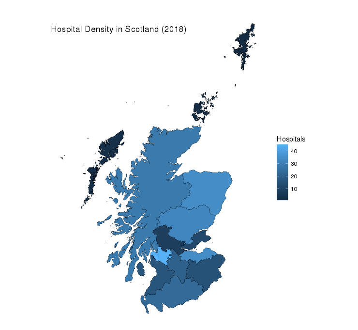
Adding Another Layer
The map we have now conveys already quite a bit of information. However, seeing that the variable Hospitals is continuous and as a result of that the colour scheme is continuous also, I think it would be nice to add labels to the map showing the actual number of hospitals in each Health Board.
In order to have some sensible coordinates for our labels it is not a bad approach to use the mean of the range of the longitude and latitude for each Health Board, so let’s start there:
HBLabel <- NHSBoards_tidy %>%
  group_by(HBName) %>%
  summarise(label_long = mean(range(long)), label_lat = mean(range(lat)), Hospitals = mean(Hospitals))
HBLabel will be the new data source for our additional layer, so it is crucial that we specify the data = argument in our geom_text() layer:
map <- ggplot(NHSBoards_tidy, aes(x = long, y = lat, group = group, fill = Hospitals)) +
  geom_polygon(color = "black", size = 0.1) +
  coord_equal() +
  theme_void() +
  labs(title = "Hospital Density in Scotland (2018)") +
  theme(plot.title = element_text(margin = margin(t = 40, b = -40)))

map +
  geom_text(data = HBLabel, mapping = aes(x = label_long, y = label_lat, label = Hospitals, group = NA)
            , cex = 4, col = "white")
Output:

Not too bad for a first shot, however, there are a couple of things wrong here. As you can see the islands don’t seem to have a label as the approximation of the geometric centre in the previous step wasn’t good enough (mean(range())). In fact, the positioning of some of the labels seems to be a bit off for some Health Boards so we will adjust these manually and set the colour for the island labels to black.
HBLabel <- NHSBoards_tidy %>%
  group_by(HBName) %>%
  summarise(label_long = mean(range(long)), label_lat = mean(range(lat)), Hospitals = mean(Hospitals)) %>%
  mutate(LabelOutsideBoundaries = HBName %in% c("Orkney", "Shetland", "Western Isles"),
         label_long = replace(label_long, HBName %in% c("Ayrshire and Arran", "Fife", "Forth Valley", "Highland", "Orkney", "Shetland", "Western Isles"),
                         c(245000, 340000, 260000, 250000, 375000, 400000, 75000)),
         label_lat = replace(label_lat, HBName %in% c("Fife", "Forth Valley", "Highland", "Orkney", "Shetland"),
                        c(710000, 700000, 810000, 1000000, 1175000)))

map +
  geom_text(data = HBLabel, mapping = aes(x = label_long, y = label_lat, label = Hospitals, group = NA, col = LabelOutsideBoundaries)
            , cex = 4, show.legend = FALSE) +
  scale_color_manual(values = c("white", "black"))
Final Output:
The code shown in this post is probably not perfect so have a play about with it and let me know if anything can be improved.
Acknowledgments
Most of the things I have learnt about visualising spatial data come from Robinlovelace’s Introduction to Visualising Spatial Data in R. My post is a somewhat distilled and ggplot2-focussed version in the spirit of Robinlovelace’s tutorial. If you have a little more time I would highly recommend to click on the above link.